If you’re searching for ways to elevate your space without overwhelming it, this guide to Bold on neutral color palettes in modern homes will show you exactly how to strike the perfect balance. Neutral interiors remain a cornerstone of modern design, but without the right accents, they can feel flat or uninspired. This article explores how to layer striking hues, statement pieces, textures, and contrast against calm backdrops to create depth, personality, and visual interest.
You’ll discover practical styling techniques, smart color pairings, and space-enhancing strategies that work in real homes—not just showrooms. From selecting accent furniture to integrating art and textiles, we break down each step so you can confidently transform your space.
Our insights are grounded in current decor trends, professional design principles, and carefully tested styling methods, ensuring you receive reliable, actionable guidance. Whether you’re refreshing a single room or redesigning your entire home, you’ll find clear direction tailored to modern living.
The Quiet Revolution: Why Modern Homes Are Embracing Understated Hues
Bold color trends flare up and fade fast—remember millennial pink?—but tranquility never goes out of style. Many homeowners crave calm yet fear muted shades will feel bland or cold (like a waiting room nobody asked for).
The truth: when you use neutral color palettes in modern homes with intention, they create depth, not dullness.
Common frustrations include:
- Walls that look flat instead of layered
- Rooms that feel sterile rather than serene
- Trend fatigue from repainting every year
This guide shows how to layer texture and add meaningful contrast with confidence.
Defining the Palette: What Exactly Is a Subdued Color Scheme?
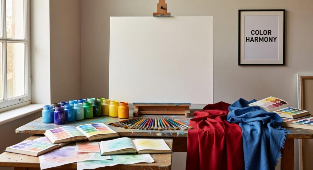
Let’s get this out of the way: subdued does NOT mean boring beige. A subdued color scheme refers to hues with low saturation—meaning less intensity or brightness. Think softened, quieted, dialed-down color. Not dull. Just restrained (there’s a difference).
Any shade on the color wheel can be muted. Lime becomes sage green. Magenta mellows into dusty rose. Royal blue settles into slate. That’s the magic—subdued is a treatment, not a specific color family.
To understand how it works, you need three simple terms:
- Tone: adding gray to a color to soften it.
- Shade: adding black to deepen it.
- Tint: adding white to lighten it.
These adjustments create complexity. Greige blends gray and beige with subtle warmth. Mushroom carries taupe undertones. Oatmeal feels creamy and soft. Terracotta leans earthy with orange-red warmth. Warm putty balances beige and gray without going cold.
Personally, I think subdued palettes feel more livable. Bright colors can be exciting, sure—but do you really want your living room shouting at you every day?
Use neutral color palettes in modern homes when you want cohesion, but don’t stop there. Subdued greens, blues, and blush tones add personality without chaos (like a great supporting actor who steals the scene quietly). Pro tip: always test undertones in natural light before committing.
The Psychology of Serenity: Why Muted Tones Create Calmer Spaces
In a world buzzing with notifications, headlines, and endless scrolling, home has become more than a place to sleep—it’s a sanctuary. Subdued colors act like noise-canceling headphones for your eyes. Because they are visually quiet, they reduce mental stimulation and help the brain shift from alert mode to rest mode (a kind of digital detox for your walls). Research in environmental psychology suggests that low-arousal environments can lower stress and improve overall well-being (American Psychological Association).
At the same time, these palettes echo the natural world. Think of stone, clay, sand, and weathered wood. This connection reflects biophilic design—a concept that integrates natural elements into built spaces to reduce stress and enhance mood (Terrapin Bright Green, 2014). In other words, when your living room mirrors a calm beach or a misty forest, your nervous system gets the memo.
Moreover, muted tones carry a quiet sophistication. Unlike bold trends that flare up and fade (remember the avocado-green kitchens?), subdued shades age gracefully. They create a timeless canvas that lets art, furniture, and personal details shine without competition.
Finally, softer hues gently reflect natural light, making rooms feel open and airy rather than stark or glaring. Use neutral color palettes in modern homes, and the effect is similar to diffused daylight through linen curtains—expansive, flattering, and effortlessly serene. In the end, calm colors don’t shout for attention; they simply let you exhale.
The 60-30-10 Rule, Reimagined
Think of the 60-30-10 rule as a well-balanced meal. The base neutral (60%) is your main course—steady and grounding, like walls in warm taupe or soft stone. The secondary muted color (30%) is the side dish—perhaps a sage sofa or a dusty blue rug. The final 10%? That’s the seasoning: cushions, art, or ceramics in a soft accent tone. In neutral color palettes in modern homes, this structure keeps the room cohesive without feeling flat.
Layering Tones Like a Soundtrack
Layering tones works like building a playlist within the same genre. A monochromatic scheme—say, multiple shades of greige—feels smooth and immersive. An analogous pairing, like soft sage with muted olive, adds gentle variation without visual noise. The result is harmony, not contrast for contrast’s sake (because not every room needs to shout to be heard).
Texture Is Your Secret Weapon
When color contrast is low, texture becomes the plot twist. Linen drapes, boucle chairs, raw wood tables, rattan accents, and matte-finish ceramics create depth you can almost feel. Texture is what makes a quiet palette speak. It’s the difference between a flat canvas and an oil painting layered with brushstrokes. Pro tip: mix at least three distinct textures in every room to avoid a showroom look.
Choosing the Right White
White trim is the frame around your masterpiece. A creamy white complements warm schemes; a gray-toned white sharpens cooler spaces. The wrong undertone can clash subtly (like wearing two almost-matching blacks). For more ways to refine clean spaces, explore smart storage solutions for sleek modern interiors.
Avoiding the Void: How to Add Depth and Personality
A room without contrast can feel like a blank canvas that was never finished. In spaces built on neutral color palettes in modern homes, add a single dark anchor—a black metal lamp, a charcoal vase, or a deep walnut frame. That note of contrast sharpens everything around it (like eyeliner for your living room).
Bring in life with:
- Leafy plants that rustle softly
- Fresh flowers with a faint, clean scent
- Natural wood that feels warm beneath your fingertips
Finally, layer lighting—ambient glow, focused task beams, subtle accents—so evenings feel golden, not flat.
Last year, I repainted my living room three times before realizing calm isn’t a color—it’s a philosophy. A subdued palette isn’t about chasing trends; it’s about creating peace that lasts. When I began layering tones, adding linen and oak for texture, and introducing subtle contrast through matte black hardware, the space finally exhaled (and so did I).
The beauty of use neutral color palettes in modern homes is their permanence.
Start small.
- Gather paint chips
- Collect fabric swatches
- Watch them in your home’s light
That simple step turns inspiration into intention. Sophistication grows quietly, one thoughtful layer at a time.
Bringing Calm and Cohesion to Your Space
You started this guide looking for clarity on how to create a home that feels cohesive, stylish, and effortlessly modern. Now you understand how neutral color palettes in modern homes create balance, enhance natural light, and make any space feel larger and more intentional.
If you’ve ever felt overwhelmed by clashing tones, visual clutter, or rooms that just don’t “flow,” you’re not alone. The right neutral foundation eliminates that stress. It gives you flexibility, timeless appeal, and a polished look without constant redesigns.
Now it’s time to take action. Start by evaluating one room this week—simplify the color scheme, layer complementary textures, and swap bold distractions for warm, balanced neutrals. Small updates can completely transform how your space feels.
If you want step-by-step styling guidance, trend insights, and practical space-optimization strategies trusted by thousands of modern home enthusiasts, explore our expert decor guides today. Don’t settle for a space that feels unfinished—create a home that feels calm, cohesive, and beautifully designed. Start your transformation now.
 Director of Community & Partnerships
Ask Eloria Esthova how they got into decor trends and shifts and you'll probably get a longer answer than you expected. The short version: Eloria started doing it, got genuinely hooked, and at some point realized they had accumulated enough hard-won knowledge that it would be a waste not to share it. So they started writing.
What makes Eloria worth reading is that they skips the obvious stuff. Nobody needs another surface-level take on Decor Trends and Shifts, Space Optimization Hacks, In-Depth Guides. What readers actually want is the nuance — the part that only becomes clear after you've made a few mistakes and figured out why. That's the territory Eloria operates in. The writing is direct, occasionally blunt, and always built around what's actually true rather than what sounds good in an article. They has little patience for filler, which means they's pieces tend to be denser with real information than the average post on the same subject.
Eloria doesn't write to impress anyone. They writes because they has things to say that they genuinely thinks people should hear. That motivation — basic as it sounds — produces something noticeably different from content written for clicks or word count. Readers pick up on it. The comments on Eloria's work tend to reflect that.
Director of Community & Partnerships
Ask Eloria Esthova how they got into decor trends and shifts and you'll probably get a longer answer than you expected. The short version: Eloria started doing it, got genuinely hooked, and at some point realized they had accumulated enough hard-won knowledge that it would be a waste not to share it. So they started writing.
What makes Eloria worth reading is that they skips the obvious stuff. Nobody needs another surface-level take on Decor Trends and Shifts, Space Optimization Hacks, In-Depth Guides. What readers actually want is the nuance — the part that only becomes clear after you've made a few mistakes and figured out why. That's the territory Eloria operates in. The writing is direct, occasionally blunt, and always built around what's actually true rather than what sounds good in an article. They has little patience for filler, which means they's pieces tend to be denser with real information than the average post on the same subject.
Eloria doesn't write to impress anyone. They writes because they has things to say that they genuinely thinks people should hear. That motivation — basic as it sounds — produces something noticeably different from content written for clicks or word count. Readers pick up on it. The comments on Eloria's work tend to reflect that.