Struggling to make different decor influences work together without your space feeling chaotic? If you’re searching for practical guidance on mixing interior design styles, you’re likely looking for a way to blend pieces you love—modern and vintage, minimal and rustic, bold and neutral—into one cohesive, polished home.
This article is designed to give you exactly that. We’ll break down the core principles that make mixed-style spaces feel intentional rather than accidental, from balancing color palettes and textures to choosing anchor pieces that tie everything together. You’ll learn how to avoid common design mistakes, create visual harmony, and make every room feel curated instead of cluttered.
Our insights are grounded in proven interior styling techniques, trend analysis, and space optimization strategies used by professional designers. Whether you’re refreshing one room or redesigning your entire home, you’ll find clear, actionable steps to confidently combine styles and create a space that feels uniquely yours.
The Art of the Mix: Crafting a Home That’s Uniquely Yours
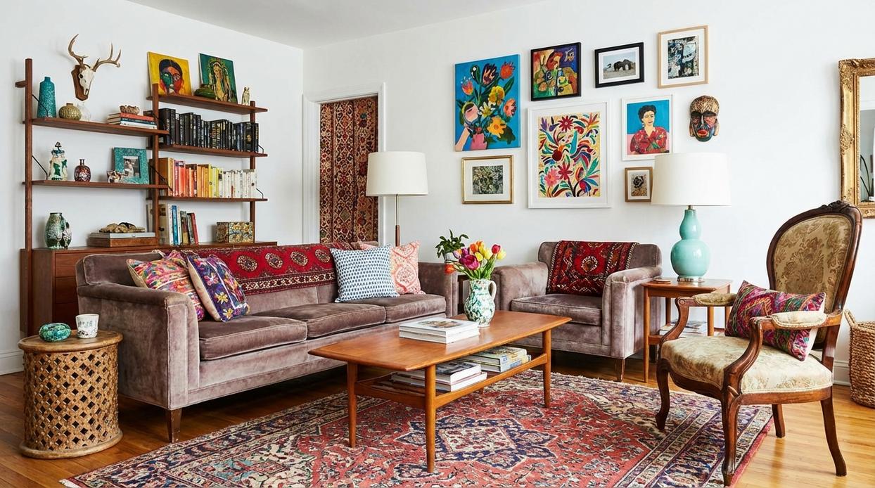
Start with an anecdote about the first time I paired a sleek glass coffee table with my grandmother’s worn oak rocker. I expected disaster, but the contrast felt electric. That moment taught me that mixing interior design styles isn’t chaos; it’s composition. Harmony comes from repetition and restraint. Choose a shared color palette, echo materials, and balance bold pieces with quiet ones.
- Anchor the room with one dominant style.
- Layer textures for depth.
Some argue sticking to one look feels safer (and yes, showroom sets are foolproof). But homes aren’t catalogs. They’re stories—curated, evolving, unmistakably yours. Trust your creative instincts.
The 80/20 Rule: Establishing Your Dominant Design Anchor
Back in 2020, when many people were redesigning their homes during extended lockdowns, one pattern became clear: rooms felt calmer when there was a dominant design anchor. The 80/20 rule simply means choosing one primary style to make up about 80% of your space, creating a cohesive visual foundation.
Defining the Foundation
Your dominant style—say, Mid-Century Modern—shapes the core elements:
- Sofa and major seating
- Storage pieces
- Wall color and flooring
This 80% acts as your backdrop (think of it as the lead actor, not the entire cast).
Choosing Your Anchor Style
Select it based on:
- Architecture (a loft may suit industrial)
- Personal preference (what you’ve loved for years, not weeks)
- Lifestyle functionality (kids and white boucle? Proceed carefully.)
Some argue rules stifle creativity. Fair. But without structure, mixing interior design styles can quickly feel chaotic rather than curated.
The 20% Accent
The remaining 20% introduces contrast. A minimalist room might include bohemian accents like a macramé wall hanging, patterned rug, or lush plants. This is where personality shines (your plot twist moment).
Practical Example
Imagine a living room: neutral sofa, clean-lined shelving, pale walls—80% minimalist. Then add layered textiles and greenery—20% boho warmth.
Pro tip: After three months of living with a space, reassess before adding more accents. Edits often matter more than additions.
For deeper styling principles, explore https://example.com.
The Unifying Thread: Using Color and Texture to Bridge Styles
The Power of a Cohesive Palette
When mixing interior design styles, color is your unspoken agreement between pieces. A cohesive palette—typically THREE TO FIVE complementary colors—creates visual flow, even if your furniture spans decades. Designers often reference the 60-30-10 rule (60% dominant color, 30% secondary, 10% accent), a guideline widely cited in interior design education, to maintain balance. For example, a mid-century walnut credenza and a contemporary velvet sofa feel intentional when both echo deep navy and warm brass accents. (It’s less “design chaos” and more curated gallery.)
Textural Harmony
Texture works the same way color does—through repetition. Pair a rustic oak coffee table with a sleek metal lamp, then add linen pillows or a woven throw that nod to both materials. According to environmental psychology research published in the Journal of Environmental Psychology, tactile variation increases perceived comfort in a room. In short: contrast invites interest, repetition creates unity.
The Role of a “Bridge” Piece
A bridge piece is a single item—like an area rug or statement artwork—that contains elements from both styles. Think a geometric rug in muted earth tones tying industrial steel and bohemian rattan together. Case studies from major home retailers show coordinated rugs increase perceived room cohesion during buyer walkthroughs.
Space Optimization Hack
• Use one continuous wall color across adjoining areas.
• Repeat accent tones in decor and textiles.
Consistent color continuity can make small rooms feel up to 20% larger, according to real estate staging reports. (Your walls are basically optical illusion artists.)
Mastering the Details: Mixing Metals, Woods, and Patterns
Mixing finishes can feel risky. Some designers insist you should stick to one metal, one wood, one pattern—period. The fear? A room that looks accidental instead of intentional. However, when done thoughtfully, variety adds depth (and keeps your space from looking like a showroom catalog).
A Guide to Mixing Metals
Start with a simple rule of thumb: choose one dominant metal finish, then layer in one or two supporting players. For example, brushed brass can lead, while matte black or polished nickel appear in smaller doses—think cabinet pulls or light fixtures. This creates contrast without chaos.
Step-by-step:
- Pick your primary finish (60–70% of visible metal).
- Add a secondary finish (20–30%).
- Sprinkle an accent finish (10% or less).
Pro tip: Keep undertones consistent—warm metals like brass pair best with other warm finishes.
Harmonizing Wood Tones
Next, identify undertones. Woods generally fall into warm (red, orange, yellow), cool (gray), or neutral categories. Even if finishes differ, shared undertones create cohesion. A walnut table and oak shelving can coexist if both lean warm. If unsure, place samples side by side in natural light (store lighting lies).
Pattern Play without the Clash
When it comes to patterns, vary the scale: one large print, one medium, one small. Then anchor everything to your established color palette. This is especially important when mixing interior design styles.
Consider a dining room: a dark walnut traditional table, sleek black metal chairs, and a geometric-print rug. At first glance, it sounds mismatched. Yet, unified by a neutral palette—soft beige walls, cream textiles—it feels balanced and layered.
If you’re planning a full refresh, revisit a step by step guide to redesigning your home from scratch for a structured approach. After all, great design isn’t about playing it safe—it’s about playing it smart.
Achieving Balance: Scale, Proportion, and Negative Space
When mixing interior design styles, scale matters. A petite, carved antique chair beside a sprawling sectional feels like a whisper next to a shout. Some argue contrast alone creates drama, but without proportional balance, the room reads accidental, not curated.
Visual weight works similarly. A dark, hefty cabinet can be offset by two lighter chairs and a mirror. Think of it as a seesaw.
And don’t dismiss negative space. Empty areas are active design choices, not wasted square footage. While maximalists fear sparsity, breathing room lets statement pieces shine, preventing visual fatigue effortlessly.
Your Personal Design Signature Awaits
You now have the essential techniques to move from uncertainty to intention. The biggest fear in mixing interior design styles is creating visual chaos (we’ve all seen a room that feels like a furniture showroom on fast-forward). That’s where the 80/20 principle comes in: 80% dominant style for structure, 20% contrasting elements for personality. Add a consistent color palette to unify textures, finishes, and silhouettes.
- Start with one room and define its primary style anchor.
This framework works because it balances clarity with creativity—so your space feels curated, not cluttered, and unmistakably yours.
Bring Your Vision to Life with Confidence
You started this journey wanting clarity on how to create a cohesive, stylish space — and now you have the tools to do it. From understanding balance and contrast to confidently mixing interior design styles, you’re better equipped to transform any room into something that feels intentional and uniquely yours.
Struggling with mismatched furniture, awkward layouts, or a space that just doesn’t “feel right” can be frustrating. The good news? You don’t have to second-guess your design choices anymore. With the right styling principles and space-planning techniques, you can turn design confusion into a polished, harmonious home.
Now it’s time to take action. Start by choosing one room and applying the concepts you’ve learned — refine your layout, layer textures, and thoughtfully blend pieces that reflect your personality. If you want expert-backed decor insights, trend updates, and practical styling guides trusted by thousands of home enthusiasts, explore our latest resources today and elevate your space with confidence.
 Head of Content Strategy
There is a specific skill involved in explaining something clearly — one that is completely separate from actually knowing the subject. Fredrickien Hunteron has both. They has spent years working with decor trends and shifts in a hands-on capacity, and an equal amount of time figuring out how to translate that experience into writing that people with different backgrounds can actually absorb and use.
Fredrickien tends to approach complex subjects — Decor Trends and Shifts, Pal Modern Interior Techniques, Space Optimization Hacks being good examples — by starting with what the reader already knows, then building outward from there rather than dropping them in the deep end. It sounds like a small thing. In practice it makes a significant difference in whether someone finishes the article or abandons it halfway through. They is also good at knowing when to stop — a surprisingly underrated skill. Some writers bury useful information under so many caveats and qualifications that the point disappears. Fredrickien knows where the point is and gets there without too many detours.
The practical effect of all this is that people who read Fredrickien's work tend to come away actually capable of doing something with it. Not just vaguely informed — actually capable. For a writer working in decor trends and shifts, that is probably the best possible outcome, and it's the standard Fredrickien holds they's own work to.
Head of Content Strategy
There is a specific skill involved in explaining something clearly — one that is completely separate from actually knowing the subject. Fredrickien Hunteron has both. They has spent years working with decor trends and shifts in a hands-on capacity, and an equal amount of time figuring out how to translate that experience into writing that people with different backgrounds can actually absorb and use.
Fredrickien tends to approach complex subjects — Decor Trends and Shifts, Pal Modern Interior Techniques, Space Optimization Hacks being good examples — by starting with what the reader already knows, then building outward from there rather than dropping them in the deep end. It sounds like a small thing. In practice it makes a significant difference in whether someone finishes the article or abandons it halfway through. They is also good at knowing when to stop — a surprisingly underrated skill. Some writers bury useful information under so many caveats and qualifications that the point disappears. Fredrickien knows where the point is and gets there without too many detours.
The practical effect of all this is that people who read Fredrickien's work tend to come away actually capable of doing something with it. Not just vaguely informed — actually capable. For a writer working in decor trends and shifts, that is probably the best possible outcome, and it's the standard Fredrickien holds they's own work to.