If you’re searching for ways to create a warm, grounded, and effortlessly stylish home, this guide to earthy tones in interiors is exactly what you need. From calming clay hues to rich forest greens and muted browns, earthy palettes have become a cornerstone of modern interior design—and for good reason. They bring balance, comfort, and timeless appeal to any space.
In this article, you’ll discover how to choose the right earthy shades for your rooms, how to layer textures for depth, and how to pair natural colors with modern finishes for a refined look. Whether you’re redesigning a single room or refreshing your entire home, you’ll find practical styling tips and space-enhancing techniques you can apply immediately.
Our recommendations are based on in-depth research into current decor trends, proven design principles, and real-world space optimization strategies—so you can feel confident you’re making choices that are both beautiful and functional.
Bring the calm of the wild into your living space and feel the shift immediately. When you Use earthy tones in interiors, you create rooms that feel GROUNDED, BALANCED, and deeply restorative. Think forest greens paired with warm walnut, coastal blues softened by sandy beige, desert terracotta against creamy white, or mountain grays layered with charcoal.
Benefits you’ll notice:
- Less visual stress and more DAILY CALM
- A cohesive, designer-level look
- Spaces that feel timeless, not trendy
Nature already mastered color harmony (no mood board required). By echoing its palettes, your home becomes a sanctuary—serene, stylish, and effortlessly connected to the outdoors.
Deep & Grounding: The Forest Floor Palette
As earthy tones and natural materials become increasingly popular in modern interiors, they’re also creating the perfect backdrop for incorporating stylish accent walls, which you can learn more about in our article on the top 7 ways to use them without overpowering your space – for more details, check out our Top 7 Ways to Use Accent Walls Without Overpowering Your Space.
Some rooms whisper. Others anchor you like the steady trunk of an old oak. The Forest Floor Palette belongs to the second kind.
At its heart are deep moss green, rich soil brown, muted mushroom taupe, and charcoal gray. Think of these shades as the roots of a tree system—intertwined, supportive, quietly powerful. Moss green spreads across a wall the way ivy claims stone, enveloping the space in calm. Soil brown grounds the room like fertile earth after rain (that faint, comforting petrichor feeling). Taupe and gray drift in like morning fog, softening edges and muting glare.
Designers often say to avoid dark colors in smaller rooms. But that’s like saying forests are gloomy because the canopy filters light. In reality, depth creates intimacy. These tones don’t shrink a room—they cradle it.
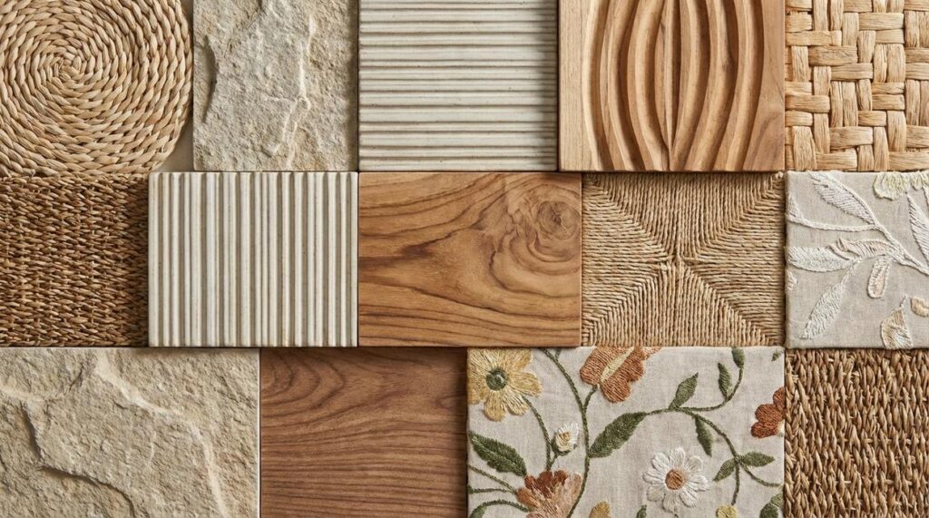
To use earthy tones in interiors effectively, layer rather than match. Walnut or oak furniture acts like sturdy tree trunks. Worn leather and wool textiles become the forest undergrowth—textured, touchable, alive. A charcoal rug beneath moss cabinetry feels as natural as shadow beneath leaves.
If you want a space that feels less like a showroom and more like a refuge, this palette is your compass pointing home.
Light & Airy: The Coastal Shoreline Palette
The Coastal Shoreline palette blends sandy beige, soft off-white, pale watery blue, and pebble gray to create interiors that feel open and breathable. Designers often note that lighter color schemes can make rooms feel up to 20% larger, according to real estate staging studies from Zillow (2023). That sense of expanded space is exactly what this palette delivers (like opening the windows on the first warm spring day).
Some argue that airy neutrals feel bland or overly safe. It’s a fair critique—minimal color can fall flat without contrast. Yet when layered thoughtfully, these hues create depth without visual clutter. Think of Nancy Meyers movie interiors: relaxed, polished, and effortlessly welcoming.
How to apply it effectively:
- Use sandy beige as the primary wall color for warmth.
- Paint trim and ceilings off-white to reflect natural light.
- Add pale blue and pebble gray through pillows, throws, or glassware.
Material pairings matter just as much as paint. Light woods like ash or maple, linen upholstery, and jute rugs reinforce texture and authenticity. In fact, biophilic design research from Terrapin Bright Green shows natural materials reduce stress and boost well-being. Pro tip: layer at least three textures per room to avoid a flat finish.
Use earthy tones in interiors in the section once exactly as it is given.
Warm & Radiant: The Desert Sunset Palette
The Desert Sunset palette blends terracotta, dusty rose, warm ochre, and creamy white to create a space that feels grounded yet glowing. But what do these colors really mean in practice?
Terracotta is a clay-based, burnt-orange tone (think Mediterranean rooftops). Dusty rose is a muted pink with gray undertones, softer than bubblegum and far more sophisticated. Warm ochre sits between mustard and gold, while creamy white avoids the starkness of pure white by adding subtle warmth.
Together, they generate an inviting, social energy—ideal for kitchens and dining areas where connection happens naturally. Some people argue bold shades like terracotta can overwhelm a room. That’s fair. However, the key is proportion. Use terracotta on a single feature wall or through pottery and textiles, then balance it with expansive creamy white surfaces. In this way, intensity feels intentional, not overpowering.
Meanwhile, layer ochre and dusty rose through cushions, art, or upholstered chairs for depth. (Think of it as seasoning a dish—too much spice ruins it, just enough makes it memorable.)
This palette pairs beautifully with clay tiles, rattan furniture, and woven cotton or cactus silk. If you’re exploring smart home aesthetics blending technology with style, warm textures help soften modern tech.
Ultimately, Use earthy tones in interiors to cultivate warmth that feels both timeless and creatively alive.
Crisp & Majestic: The Mountain Peak Palette
There’s something undeniably powerful about a mountain-inspired color scheme. Slate gray, deep charcoal, crisp snow white, and a restrained touch of evergreen or sky blue come together to create a look that feels grounded yet elevated. It’s strong without being loud (think modern penthouse, not cozy cabin).
Why It Works So Well
At its core, this palette is about contrast. Charcoal walls or lower kitchen cabinets paired with bright white countertops create sharp visual clarity. Meanwhile, slate gray flooring or a large sectional anchors the room, giving it weight and stability. The subtle hint of blue or green prevents the scheme from feeling sterile—though I’ll admit, finding the right shade can be trickier than it sounds. Too icy, and the space feels cold; too muted, and it disappears entirely.
Some designers argue you should Use earthy tones in interiors to make spaces feel warmer and more inviting. That’s fair. However, when balanced with dark-stained wood, concrete textures, and black metal fixtures, this cooler palette can feel equally welcoming—just in a more minimalist way.
In home offices, kitchens, or streamlined living rooms, the effect is clarity and focus. Simple textiles, clean lines, and deliberate accents keep the atmosphere crisp, composed, and quietly majestic.
Weaving Your Natural Narrative with Color
Now that you’ve explored your options, it’s time to choose with intention. Start by deciding the feeling you want every time you walk through the door—grounded, breezy, cozy, or quietly dramatic. Then, use earthy tones in interiors to anchor that mood with warmth and authenticity.
Next, gather tangible samples:
- Paint chips in two to three shades
- Fabric swatches with texture
- Wood finishes that complement your palette
Lay them side by side and notice what feels harmonious (your instincts are smarter than you think). Ultimately, commit to the palette that feels like an exhale—comfortable, personal, and unmistakably yours.
Bring Warmth and Balance Into Your Space Today
You set out to understand how to use earthy tones in interiors to create a home that feels grounded, warm, and effortlessly stylish. Now you know how these natural hues add depth, calm visual clutter, and transform any room into a welcoming retreat.
If you’ve been struggling with a space that feels cold, disconnected, or lacking personality, the right blend of warm browns, muted greens, clay shades, and soft neutrals can completely shift the atmosphere. Thoughtful layering, balanced textures, and intentional accents make all the difference.
Now it’s time to act. Start by choosing one room and introducing a core earthy palette through paint, textiles, or statement decor. Build around it with natural materials and subtle contrast to create harmony.
If you want step-by-step styling guidance, trend insights, and practical space optimization hacks trusted by thousands of decor enthusiasts, explore our expert home styling guides today. Discover how to confidently design a space that feels cohesive, modern, and unmistakably yours—start transforming your home now.
 Head of Content Strategy
There is a specific skill involved in explaining something clearly — one that is completely separate from actually knowing the subject. Fredrickien Hunteron has both. They has spent years working with decor trends and shifts in a hands-on capacity, and an equal amount of time figuring out how to translate that experience into writing that people with different backgrounds can actually absorb and use.
Fredrickien tends to approach complex subjects — Decor Trends and Shifts, Pal Modern Interior Techniques, Space Optimization Hacks being good examples — by starting with what the reader already knows, then building outward from there rather than dropping them in the deep end. It sounds like a small thing. In practice it makes a significant difference in whether someone finishes the article or abandons it halfway through. They is also good at knowing when to stop — a surprisingly underrated skill. Some writers bury useful information under so many caveats and qualifications that the point disappears. Fredrickien knows where the point is and gets there without too many detours.
The practical effect of all this is that people who read Fredrickien's work tend to come away actually capable of doing something with it. Not just vaguely informed — actually capable. For a writer working in decor trends and shifts, that is probably the best possible outcome, and it's the standard Fredrickien holds they's own work to.
Head of Content Strategy
There is a specific skill involved in explaining something clearly — one that is completely separate from actually knowing the subject. Fredrickien Hunteron has both. They has spent years working with decor trends and shifts in a hands-on capacity, and an equal amount of time figuring out how to translate that experience into writing that people with different backgrounds can actually absorb and use.
Fredrickien tends to approach complex subjects — Decor Trends and Shifts, Pal Modern Interior Techniques, Space Optimization Hacks being good examples — by starting with what the reader already knows, then building outward from there rather than dropping them in the deep end. It sounds like a small thing. In practice it makes a significant difference in whether someone finishes the article or abandons it halfway through. They is also good at knowing when to stop — a surprisingly underrated skill. Some writers bury useful information under so many caveats and qualifications that the point disappears. Fredrickien knows where the point is and gets there without too many detours.
The practical effect of all this is that people who read Fredrickien's work tend to come away actually capable of doing something with it. Not just vaguely informed — actually capable. For a writer working in decor trends and shifts, that is probably the best possible outcome, and it's the standard Fredrickien holds they's own work to.