If you’re here, you’re likely looking for clear, practical guidance on choosing a home color palette that truly reflects your style while enhancing your space. With endless shades, trends, and opinions online, it’s easy to feel overwhelmed and second-guess every swatch. This article is designed to cut through that noise and give you a structured, easy-to-follow approach to choosing a home color palette that works for your lighting, layout, and lifestyle.
We’ve analyzed current decor trends, studied how color psychology influences mood, and examined modern interior design techniques to bring you advice that’s both creative and grounded in proven design principles. Whether you’re refreshing a single room or redesigning your entire home, you’ll find actionable tips, space-optimizing color strategies, and timeless combinations you can confidently use. By the end, you’ll not only understand what colors look good together—but why they work in your specific space.
Choosing colors for your home can feel overwhelming, leading to decision paralysis or expensive do-overs. However, choosing a home color palette does not have to be guesswork. This guide lays out a clear, step-by-step framework rooted in foundational interior design principles professionals use every day. First, assess fixed elements like flooring and countertops to anchor your scheme; next, define a dominant tone, supporting shades, and strategic accents for balance. In addition, test samples in varied lighting to confirm harmony. By the end, you will have a practical method to confidently translate your vision into a cohesive palette for any room.
Start With Inspiration, Not Just Paint Swatches
Staring at a wall of tiny paint chips can feel oddly overwhelming. Everything looks different under store lighting, and somehow the shade you loved turns neon the second it hits your wall (why does that always happen?). Instead of starting with swatches, start with an anchor piece—an item you already love. This could be a rug, artwork, a sofa, or even a patterned jacket that makes you feel put together.
First, identify the dominant color (the most visible shade), the secondary color (the supporting hue), and the accent color (the pop that adds personality). Together, they form your ready-made palette.
Next, create a mood board. Use Pinterest or a physical board to gather images, textures, and fabrics that echo the same feeling. This makes choosing a home color palette far less frustrating and far more intentional.
Actionable tip: Photograph your anchor piece in natural light and use an online color picker to capture the exact shades.
Decoding Color Harmony: Key Schemes Explained
The color wheel isn’t a strict rulebook—it’s more like a GPS for choosing a home color palette. It shows relationships between colors so you can design with intention instead of guesswork (and avoid the “why does this feel off?” moment).
Here’s how I see the four key schemes:
| Scheme | What It Uses | Overall Feeling |
|---|---|---|
| Monochromatic | Tints, tones, shades of one color |
Serene, cohesive |
| Analogous | Neighboring colors | Calm, harmonious |
| Complementary | Opposite colors | Energetic, bold |
| Triadic | Three evenly spaced colors | Balanced, vibrant |
Monochromatic designs layer light and dark versions of a single hue. Think deep navy, dusty blue, and pale sky. It’s SOPHISTICATED without trying too hard.
Analogous schemes—like blue, blue-green, and green—feel natural because they mirror what we see in landscapes (nature rarely clashes).
Complementary palettes, such as blue and orange, bring punchy contrast. Some argue they’re too loud. I disagree—used thoughtfully, they create dynamic spaces that feel alive.
Triadic combinations balance contrast and harmony. They’re bold but controlled—like a Wes Anderson set, but livable.
Pro tip: if a scheme feels overwhelming, mute one color and let the others support it.
The 60-30-10 Rule: A Foolproof Formula for Balance
The 60-30-10 rule is a classic interior design ratio that divides a room’s color scheme into harmonious proportions: 60% dominant color, 30% secondary color, and 10% accent color. Think of it as a visual budgeting system—except instead of money, you’re allocating color.
60% (Main Color): Usually walls, large rugs, or a sofa. This shade defines the mood. A warm beige creates calm; a deep navy adds drama. When choosing a home color palette, this is your foundation.
30% (Secondary Color): Found in chairs, curtains, or even cabinetry. It should contrast enough to create depth without fighting the main hue.
10% (Accent Color): Pillows, art, vases—small pieces with big personality. This is your “plot twist” (think the red coat in Schindler’s List).
Some argue rigid formulas stifle creativity. Fair. But structure actually frees you to experiment confidently—especially when styling shelves like a pro balance height and texture: https://mintpaldecor.com.co/styling-shelves-like-a-pro-balance-height-and-texture/.
Pro tip: If a room feels off, check your ratios before buying more decor.
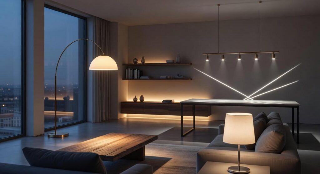
How Light and Room Size Transform Color

A paint color will never look the same in the store as it does in your home. That’s not bad luck—it’s physics. Light temperature (the warmth or coolness of light) and room scale dramatically shift how color appears.
- North-facing rooms cast cool, bluish light that can mute warm tones like beige or peach.
- South-facing rooms flood spaces with warm, bright light that intensifies most hues (sometimes more than you expect).
Artificial Light
Warm bulbs (yellow-toned) enrich reds and creams, while cool bulbs (blue-toned) sharpen grays and whites. Swap the bulb, and your wall may suddenly feel completely different (yes, it’s that dramatic).
Space Optimization Hack: Light, cool shades can visually expand tight spaces, while dark, warm tones make large rooms feel intimate and grounded.
Some argue color choice matters more than lighting. Fair—but when choosing a home color palette, light is the silent co-designer.
Prediction: As smart lighting becomes standard, adaptable color schemes will likely trend upward.
The Crucial Final Step: Test Your Colors in Real Life
Here’s the mistake almost everyone makes: choosing a paint color from a tiny paper swatch. That 2-inch square? It lies. (Harsh, but true.) Light, shadow, and surrounding decor completely change how a color reads in real life.
If you’re serious about choosing a home color palette, follow this simple process:
- Buy sample pots of your top 2–3 choices.
- Paint large swatches—at least 2×2 feet—on poster board or directly on your walls.
- Place them on different walls in the same room to see how natural light shifts across the day.
- Observe for 24–48 hours, checking morning, afternoon, and nighttime with lamps on.
THIS STEP IS NON-NEGOTIABLE.
Some argue it’s overkill. But paint can look cool at noon and oddly green by sunset (yes, really).
Speculation: As homes incorporate more smart lighting, color testing will become even more critical. For deeper planning tips, see https://www.sherwin-williams.com/homeowners/color.
You’ve learned to gather inspiration, decode color harmony (how hues naturally work together), apply a balanced formula, and test before committing. Now, instead of second-guessing every swatch, you have a process. That’s the difference.
Many people think choosing a home color palette is pure instinct. It’s not. It’s structure plus creativity. And structure removes anxiety.
So here’s what I recommend:
- Pick one room.
- Choose an anchor piece (a rug, artwork, or sofa).
- Build outward using complementary tones.
Trends fade. Personal cohesion lasts. Start small, trust the method, and let one confident decision lead to the next.
Bring Your Vision to Life with Confidence
You started this guide because choosing a home color palette can feel overwhelming. Too many options. Too much pressure to get it right. And the fear of investing time and money into colors that just don’t work together.
Now you understand how to balance tones, test samples, consider lighting, and align colors with your space and style. You have the clarity to move forward without second-guessing every swatch.
The truth is, the right palette doesn’t just make a room look better — it makes your home feel cohesive, intentional, and uniquely yours.
If you’re still unsure which direction fits your space best, don’t leave it to chance. Explore our expert-backed styling guides and step-by-step color resources designed to remove the guesswork. We’re trusted by thousands of decor enthusiasts for practical, trend-aware advice that actually works.
Stop stressing over paint chips. Start creating a home that feels right the moment you walk in. Dive into our curated color guides today and transform your space with confidence.
 Director of Community & Partnerships
Ask Eloria Esthova how they got into decor trends and shifts and you'll probably get a longer answer than you expected. The short version: Eloria started doing it, got genuinely hooked, and at some point realized they had accumulated enough hard-won knowledge that it would be a waste not to share it. So they started writing.
What makes Eloria worth reading is that they skips the obvious stuff. Nobody needs another surface-level take on Decor Trends and Shifts, Space Optimization Hacks, In-Depth Guides. What readers actually want is the nuance — the part that only becomes clear after you've made a few mistakes and figured out why. That's the territory Eloria operates in. The writing is direct, occasionally blunt, and always built around what's actually true rather than what sounds good in an article. They has little patience for filler, which means they's pieces tend to be denser with real information than the average post on the same subject.
Eloria doesn't write to impress anyone. They writes because they has things to say that they genuinely thinks people should hear. That motivation — basic as it sounds — produces something noticeably different from content written for clicks or word count. Readers pick up on it. The comments on Eloria's work tend to reflect that.
Director of Community & Partnerships
Ask Eloria Esthova how they got into decor trends and shifts and you'll probably get a longer answer than you expected. The short version: Eloria started doing it, got genuinely hooked, and at some point realized they had accumulated enough hard-won knowledge that it would be a waste not to share it. So they started writing.
What makes Eloria worth reading is that they skips the obvious stuff. Nobody needs another surface-level take on Decor Trends and Shifts, Space Optimization Hacks, In-Depth Guides. What readers actually want is the nuance — the part that only becomes clear after you've made a few mistakes and figured out why. That's the territory Eloria operates in. The writing is direct, occasionally blunt, and always built around what's actually true rather than what sounds good in an article. They has little patience for filler, which means they's pieces tend to be denser with real information than the average post on the same subject.
Eloria doesn't write to impress anyone. They writes because they has things to say that they genuinely thinks people should hear. That motivation — basic as it sounds — produces something noticeably different from content written for clicks or word count. Readers pick up on it. The comments on Eloria's work tend to reflect that.