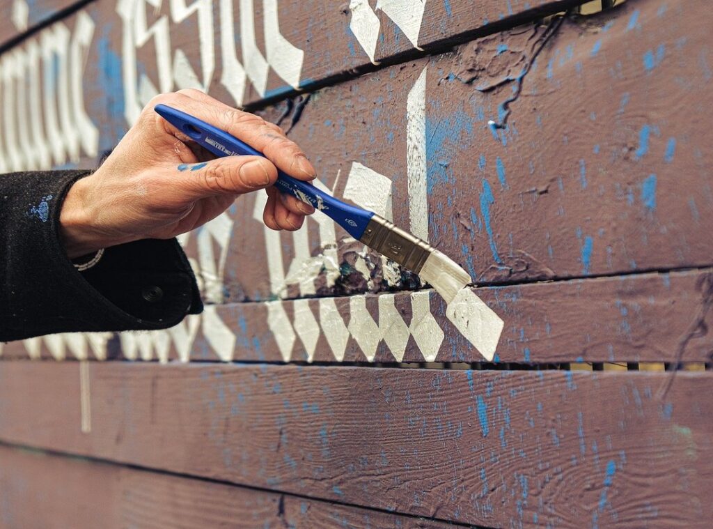
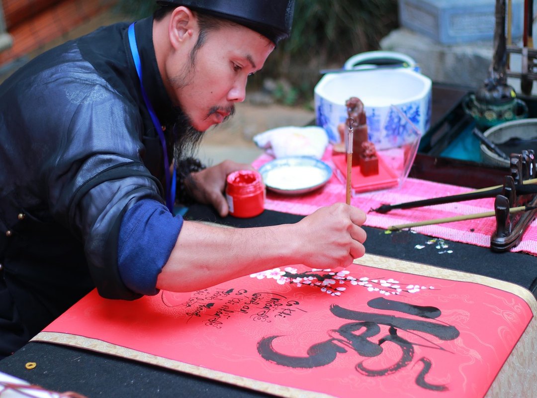
TLE calligraphy design is a stunning blend of modern minimalism and traditional fluid strokes. It’s simple yet elegant, and it’s catching on fast. People are using it for everything from custom wall art to elegant invitations.
If you’re here, you probably want to know how to get started. This guide will break down everything you need to know. No prior artistic experience?
No problem. We’ll walk you through the basics step by step. Plus, there’s a bonus.
Practicing TLE calligraphy can be a calming, focused activity. It’s like a little wellness boost while you create something beautiful.
What Defines the TLE Calligraphy Style?
TLE calligraphy is a unique and modern style that stands out with its elongated ascenders and descenders. It focuses on negative space, creating a light, airy feel. The letters flow rhythmically, connecting in a way that feels both natural and elegant.
In contrast to traditional styles like Spencerian or Copperplate, TLE calligraphy is more about simplicity and balance. Traditional calligraphy often emphasizes intricate details and flourishes, but TLE strips it down to the essentials. This makes it perfect for a modern, minimalist aesthetic.
The philosophy behind TLE calligraphy is rooted in principles like balance, simplicity, and intentional imperfection. It’s not about being flawless; it’s about embracing the beauty in subtle variations. This approach gives TLE a more organic, human touch.
Imagine a full TLE alphabet where each letter has a distinct, yet harmonious, presence. A sample quote in TLE calligraphy would showcase how the letters connect, creating a seamless, flowing line. The negative space around the letters adds to the overall elegance and readability.
TLE calligraphy design is incredibly versatile. It’s often used in logos, monograms, and minimalist art prints. Its clean lines and balanced form make it a great choice for a wide range of applications.
Whether you’re looking to create a sleek logo or a simple, beautiful piece of wall art, TLE calligraphy can add a touch of sophistication and modernity.
Gathering Your Essential Toolkit: What You Really Need
Must-Have Tools for Calligraphy
Let’s get down to the basics. You’ll need a specific type of pointed pen nib, like the Nikko G, an oblique or straight pen holder, non-waterproof black ink (Sumi ink is great), and smooth practice paper (HP Premium 32lb is a solid choice).
The nib is your main tool. It controls the flow of ink and helps you create those beautiful, varied strokes. The pen holder keeps everything steady.
Non-waterproof ink is easier to work with, especially for beginners. And the right paper? It’s crucial.
Smooth, high-quality paper prevents bleeding and feathering, making your calligraphy design look clean and professional.
Budget-Friendly Alternatives
If you’re just starting out and don’t want to break the bank, consider using a brush pen. They’re more affordable and still give you a feel for the art. Plus, they’re portable and easy to use.
Nice-to-Have Supplies
A light pad for tracing, a small jar for water, and a lint-free cloth are nice to have. The light pad is super helpful for tracing designs, the jar keeps your water handy for cleaning, and the cloth helps you keep your workspace tidy.
Pro Tip
Before you start, clean your new nibs. Use toothpaste or alcohol to remove the protective oil. This little step makes a big difference in how smoothly your ink flows.
By gathering these tools, you set yourself up for success. Quality materials mean better results, and that’s what it’s all about.
Mastering the 8 Foundational Strokes of TLE Calligraphy
Learning tle calligraphy can seem daunting, but it’s all about breaking it down. All letters are built from a few basic strokes. This makes the process less intimidating.
Entrance/Exit Hairline: Start with a light touch. Move your pen in a straight line, applying minimal pressure. This creates a thin, delicate line.
Downstroke (Applying Pressure): Begin at the top and move downward. Apply firm pressure to create a thick, bold line. Release the pressure as you near the bottom. tle calligraphy design
Underturn: Move your pen in a small, curved motion. Start with light pressure, then increase it slightly as you complete the curve.
Overturn: Similar to the underturn, but in the opposite direction. Start with light pressure, then increase it as you complete the curve.
Compound Curve: Combine two curves. Start with a light touch, then apply more pressure as you move into the second curve. Release pressure at the end.
Oval: Draw an oval shape. Start with light pressure, increase it as you go around, and release it as you close the shape.
Ascending Loop: Move your pen in a loop that goes up. Start with light pressure, increase it as you loop, and release it at the top.
Descending Loop: Move your pen in a loop that goes down. Start with light pressure, increase it as you loop, and release it at the bottom.
For each stroke, focus on the pen movement, angle, and where to apply and release pressure. This will help you create the perfect thick and thin lines.
Pro Tip: Fill a page with each basic stroke before attempting to combine them into letters. Muscle memory is key, and consistent practice is essential.
Patience and repetition are your best friends here. Don’t rush. Take your time, and soon enough, you’ll see your tle calligraphy design skills improve.
Common Pitfalls for Beginners and How to Fix Them
Starting out in calligraphy can be a bit daunting. Trust me, I’ve been there. One of the most common mistakes is an inconsistent pen angle.
The nib should always point in the same direction, typically towards the top corner of the page. This ensures your strokes are uniform and your letters look balanced.
Shaky lines are another big issue. Proper posture and breathing techniques can help. Try moving from the shoulder and arm, not just the wrist.
It makes a huge difference in the smoothness of your lines.
Ink flow can also be tricky. If the ink is too thick or thin, it won’t flow well. To diagnose, check if the ink is dripping or barely coming out.
When dipping the pen, make sure not to overload it. A little goes a long way.
Spacing and rhythm are key. Practice connecting letters to understand how they flow together naturally. This will give your tle calligraphy design a more fluid and professional look.
By addressing these common pitfalls, you’ll see a significant improvement in your calligraphy. Your work will look neater, and you’ll enjoy the process more.
Bringing Your TLE Calligraphy Designs to Life
tle calligraphy design is an art form that becomes accessible through the understanding of its core principles and the diligent practice of fundamental strokes. You now have a comprehensive roadmap, guiding you from selecting the right tools to mastering the basic forms. Start with a simple first project, like writing your name or a favorite short word.
The creative possibilities are endless, from crafting personalized gifts to adding unique home decor accents. Share your practice sheets or first designs on social media to inspire others and join a community of enthusiasts.
 FOUNDER & CEO
There is a specific skill involved in explaining something clearly — one that is completely separate from actually knowing the subject. Veronicay Simpsonita has both. They has spent years working with decor trends and shifts in a hands-on capacity, and an equal amount of time figuring out how to translate that experience into writing that people with different backgrounds can actually absorb and use.
Veronicay tends to approach complex subjects — Decor Trends and Shifts, Pal Modern Interior Techniques, Highlight Hub being good examples — by starting with what the reader already knows, then building outward from there rather than dropping them in the deep end. It sounds like a small thing. In practice it makes a significant difference in whether someone finishes the article or abandons it halfway through. They is also good at knowing when to stop — a surprisingly underrated skill. Some writers bury useful information under so many caveats and qualifications that the point disappears. Veronicay knows where the point is and gets there without too many detours.
The practical effect of all this is that people who read Veronicay's work tend to come away actually capable of doing something with it. Not just vaguely informed — actually capable. For a writer working in decor trends and shifts, that is probably the best possible outcome, and it's the standard Veronicay holds they's own work to.
FOUNDER & CEO
There is a specific skill involved in explaining something clearly — one that is completely separate from actually knowing the subject. Veronicay Simpsonita has both. They has spent years working with decor trends and shifts in a hands-on capacity, and an equal amount of time figuring out how to translate that experience into writing that people with different backgrounds can actually absorb and use.
Veronicay tends to approach complex subjects — Decor Trends and Shifts, Pal Modern Interior Techniques, Highlight Hub being good examples — by starting with what the reader already knows, then building outward from there rather than dropping them in the deep end. It sounds like a small thing. In practice it makes a significant difference in whether someone finishes the article or abandons it halfway through. They is also good at knowing when to stop — a surprisingly underrated skill. Some writers bury useful information under so many caveats and qualifications that the point disappears. Veronicay knows where the point is and gets there without too many detours.
The practical effect of all this is that people who read Veronicay's work tend to come away actually capable of doing something with it. Not just vaguely informed — actually capable. For a writer working in decor trends and shifts, that is probably the best possible outcome, and it's the standard Veronicay holds they's own work to.