Choosing the right colors for your home isn’t just about aesthetics—it’s about how you want to feel in your space. If you’re searching for ways to create a calmer bedroom, a more energizing living room, or a welcoming entryway, understanding color psychology in home decor is the key. The shades you choose can influence mood, perception of space, and even daily productivity.
This article breaks down how different colors affect emotions, how to pair tones for balance, and how to use strategic accents to transform any room without a full renovation. You’ll also discover practical tips for small spaces, modern interiors, and trending palettes that work in real homes—not just showrooms.
Our insights are grounded in established design principles, current decor trends, and expert-backed research on color behavior and spatial perception. By the end, you’ll have clear, actionable guidance to confidently select colors that align with your style and the atmosphere you want to create.
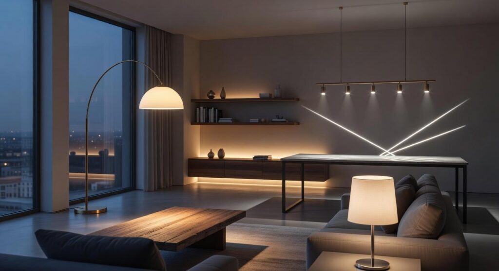
Your home isn’t just walls and furniture; it’s an emotional blueprint shaped largely by color. Many homeowners chase trends—this year’s sage green, next year’s charcoal—only to wonder why a room feels unsettled. That’s where color psychology in home decor becomes practical, not theoretical. For example, soft blues and muted greens lower heart rates and support restful sleep (a reason many spas use them), making them ideal for bedrooms. Meanwhile, warm terracottas and buttery yellows stimulate conversation in dining areas. However, critics argue mood depends more on lighting than paint. True—but layered lighting enhances color’s impact rather than replacing it entirely.
The Science of Sight: How Color Psychology Shapes Your Space
Color isn’t just decoration; it’s biology. When light enters your eyes, specialized cells called cones interpret different wavelengths and send signals to the brain’s visual cortex. Research shows that these signals can influence mood and even heart rate (Küller et al., 2009). That’s why a bold red wall can feel energizing, while a soft blue bedroom feels restful. Color shapes emotion before we consciously process it.
Designers often divide hues into warm and cool categories. Warm colors—reds, oranges, yellows—are advancing, meaning they visually “move toward” you and stimulate activity. Cool colors—blues, greens, purples—recede, creating calm and spaciousness (Elliot & Maier, 2014).
But hue alone isn’t the whole story. Saturation (intensity) and tone (lightness or darkness) fine-tune impact. A muted terracotta feels grounded; a vivid crimson demands attention (think dramatic movie set energy). When you use color psychology in home decor, subtle shifts make measurable differences.
Crafting Energy and Connection with Warm Hues

Reds (Passion, Appetite, Energy): Red is bold. In color psychology in home decor, it’s linked to heightened heart rate and stimulation (Elliot & Maier, 2014). That’s why restaurants often use it to spark appetite and conversation. In dining rooms or kitchens, small doses—an accent wall or upholstered chairs—can feel electric (think classic Italian trattoria vibes). Critics argue red is overpowering anywhere indoors. Fair. Overuse can feel like living inside an alarm bell. But controlled applications create intimacy and buzz. Bedrooms, however, may suffer; the same energy that fuels chatter can disrupt rest.
Oranges (Enthusiasm, Creativity, Warmth): Orange softens red’s intensity. It’s welcoming rather than confrontational, making entryways feel like a friendly handshake. Some designers dismiss orange as dated. Yet muted terracotta and burnt sienna are resurging in modern interiors. In home offices, orange accents can encourage creative thinking (Küller et al., 2009). Pro tip: pair with natural wood to keep it grounded.
Yellows (Happiness, Optimism, Attention): Yellow reflects light beautifully, brightening kitchens, bathrooms, and hallways. Detractors say it causes eye fatigue. They’re right—if you choose neon. Softer butter or straw tones deliver cheer without strain. Balance is everything in vibrant spaces. Choose wisely.
Designing for Calm and Focus with Cool Tones
Cool tones are colors that visually recede, meaning they appear to move away from the eye and create a sense of openness. When used intentionally, they shape mood as much as style.
Blues (Tranquility, Stability, Productivity) are a classic for bedrooms and bathrooms because blue has been shown to lower heart rate and encourage relaxation (University of Sussex, 2015). Lighter blues visually expand small rooms, making them feel airy. In contrast, navy or slate blue adds sophisticated intimacy—perfect for a reading nook (very “coastal retreat” energy, minus the sand). If you want focus in a home office, choose muted mid-tone blues for steady concentration.
Greens (Balance, Nature, Restoration) echo the natural world, which explains why green is considered the most restful color for the human eye (Pantone Color Institute). Soft sage in living rooms or bedrooms creates a serene backdrop that doesn’t overwhelm. Pro tip: pair green walls with warm wood to prevent the space from feeling too cool.
Purples (Luxury, Creativity, Wisdom) offer range. Lavender carries blue’s restful quality, ideal for bedrooms. Meanwhile, eggplant or plum delivers drama and elegance—best used on an accent wall. If you’re unsure, revisit how to choose the perfect statement piece for any room to anchor bold shades effectively.
Ultimately, color psychology in home decor works best when you match tone to function.
The Foundation of Design
Neutrals get a bad rap. I once painted my living room a bold teal, convinced drama meant personality. Within weeks, the space felt chaotic. When I swapped the walls for a warm greige—a blend of gray and beige—the art, plants, and even my leather chair suddenly stood taller. That’s the quiet power of neutrals: they create visual breathing room, meaning intentional empty space that lets other elements shine.
Warm neutrals like beige and cream feel cozy and welcoming; cool neutrals like slate and crisp white read modern and tailored. This is where color psychology in home decor matters: undertones subtly shape mood and perception.
- Pro tip: test swatches at different times of day.
Black, used sparingly, grounds a room. Think picture frames, cabinet pulls, or a floor lamp. Like eyeliner for a space (yes), it sharpens contrast and makes every hue look richer.
A Practical Guide to Room-by-Room Color Application
Color works best when it matches how you use a room (not just how it photographs). Most guides stop at trends. Here’s what they miss: FUNCTION FIRST.
Living Room (Versatility)
Start with calming neutrals like green or gray. Layer warm accents—rust pillows, ochre throws, bold art—to spark conversation without overwhelming downtime.
Bedroom (Serenity)
Cool tones such as soft blues, muted greens, or lavender help signal rest. Keep stimulating reds and bright oranges minimal (your brain doesn’t need espresso at bedtime).
Kitchen (Energy & Cleanliness)
Soft yellows boost warmth; a bold accent wall adds personality. Crisp whites and grays deliver modern clarity.
Bathroom (Calm & Clean)
Blues and greens create spa calm, while clean whites elevate freshness.
- Balance LIGHT + undertone
- Test samples at different hours
- Study color psychology in home decor
Explore deeper techniques at https://mintpaldecor.com.
Design With Purpose
You don’t need a full renovation to shift a room’s energy. START SMALL. Pick one space and define the mood: calm, focused, cozy, or energized. Then use color psychology in home decor to guide your choice.
Mood | Color | Example
—|—|—
Calm | Soft Blue | Bedroom walls
Focused | Sage Green | Home office accent
Paint one wall, swap textiles, reassess lighting. INTENTION beats impulse every time. Trust your evolving instincts.
Bring Your Space Together with Intention
You set out to understand how thoughtful design choices can completely transform your space—and now you have the tools to do exactly that. From layout balance to texture layering and especially color psychology in home decor, you’ve seen how small, intentional changes can solve the frustration of rooms that feel cluttered, dull, or disconnected.
An uninspired space doesn’t just affect how your home looks—it impacts how you feel every day. The good news? You don’t need a full renovation to fix it. With the right styling principles and a clear plan, you can create a home that feels cohesive, functional, and uniquely yours.
Now it’s time to take action. Start by choosing one room and applying the techniques you’ve learned—refine your color palette, rethink your layout, and incorporate purposeful accents. For more expert-backed decor strategies and step-by-step styling guides trusted by thousands of modern homeowners, explore our latest resources today and start transforming your space with confidence.
 FOUNDER & CEO
There is a specific skill involved in explaining something clearly — one that is completely separate from actually knowing the subject. Veronicay Simpsonita has both. They has spent years working with decor trends and shifts in a hands-on capacity, and an equal amount of time figuring out how to translate that experience into writing that people with different backgrounds can actually absorb and use.
Veronicay tends to approach complex subjects — Decor Trends and Shifts, Pal Modern Interior Techniques, Highlight Hub being good examples — by starting with what the reader already knows, then building outward from there rather than dropping them in the deep end. It sounds like a small thing. In practice it makes a significant difference in whether someone finishes the article or abandons it halfway through. They is also good at knowing when to stop — a surprisingly underrated skill. Some writers bury useful information under so many caveats and qualifications that the point disappears. Veronicay knows where the point is and gets there without too many detours.
The practical effect of all this is that people who read Veronicay's work tend to come away actually capable of doing something with it. Not just vaguely informed — actually capable. For a writer working in decor trends and shifts, that is probably the best possible outcome, and it's the standard Veronicay holds they's own work to.
FOUNDER & CEO
There is a specific skill involved in explaining something clearly — one that is completely separate from actually knowing the subject. Veronicay Simpsonita has both. They has spent years working with decor trends and shifts in a hands-on capacity, and an equal amount of time figuring out how to translate that experience into writing that people with different backgrounds can actually absorb and use.
Veronicay tends to approach complex subjects — Decor Trends and Shifts, Pal Modern Interior Techniques, Highlight Hub being good examples — by starting with what the reader already knows, then building outward from there rather than dropping them in the deep end. It sounds like a small thing. In practice it makes a significant difference in whether someone finishes the article or abandons it halfway through. They is also good at knowing when to stop — a surprisingly underrated skill. Some writers bury useful information under so many caveats and qualifications that the point disappears. Veronicay knows where the point is and gets there without too many detours.
The practical effect of all this is that people who read Veronicay's work tend to come away actually capable of doing something with it. Not just vaguely informed — actually capable. For a writer working in decor trends and shifts, that is probably the best possible outcome, and it's the standard Veronicay holds they's own work to.