If you’ve been drawn to rich colors, layered patterns, and rooms filled with personality, you’re likely searching for practical guidance on how to embrace maximalist home decor without creating visual chaos. This article is designed to help you do exactly that. We’ll break down the core principles behind this bold design style, explore how to mix textures and prints with confidence, and share space-planning techniques that keep your home feeling curated rather than cluttered.
Many homeowners love the idea of going big with design but struggle with where to start, how to balance statement pieces, or how to make everything feel cohesive. Here, you’ll find clear, step-by-step insights grounded in modern interior techniques, trend analysis, and proven styling methods used by experienced decorators.
By the end, you’ll understand how to layer color, showcase meaningful pieces, and transform any room into a vibrant, expressive space that feels intentional, elevated, and uniquely yours.
Start Bold, Then Balance
First, choose one dominant color you genuinely love—think emerald green or cobalt blue. This becomes your anchor (your room’s “main character,” if you will). Next, layer two to three supporting shades that either contrast boldly or sit nearby on the color wheel (a tool that maps color relationships). For example, pair teal with mustard and plum for depth.
However, don’t confuse bold with chaotic. Repeat each color at least twice to create rhythm. Add neutral breaks—wood, cream, or brass—to calm the eye.
Pro tip: Test swatches in natural light before committing. Fearless maximalist home decor works best when intentional.
Start with a System: The 60-30-10 Rule for Bold Palettes
Have you ever walked into a colorful room and thought, Why does this feel amazing instead of overwhelming? Chances are, there was a system behind the drama.
The 60-30-10 rule is a classic design principle that organizes color distribution: 60% dominant color, 30% secondary color, 10% accent color. The dominant color anchors the room (usually walls or large rugs). The secondary color supports it (think sofas or curtains). The accent is the spark—pillows, art, or decor pieces.
Some argue rules like this are too restrictive, especially for maximalist home decor. Shouldn’t bold design be rule-free? Not exactly. Structure actually creates FREEDOM. Your 60% doesn’t have to be beige—it can be a deep jewel tone like emerald or sapphire. The rule guides intensity so the space feels intentional, not chaotic.
Try this:
- 60% deep teal walls
- 30% mustard yellow sofa and curtains
- 10% fuchsia pink in throw pillows and art
Can you picture it? Vibrant, yet balanced.
Before committing, create a mood board with paint swatches, fabric samples, or digital pins. Seeing the ratio visually helps you adjust before spending a dime (and saves you from impulse buys). Pro tip: squint at your board—if one color dominates too much, rebalance before you roll the paint.
Beyond the Accent Wall: Creative Canvases for Color
The Fifth Wall
Most people stop at four walls. But the ceiling—often called the fifth wall—is prime real estate. Painting it a high-gloss navy creates drama and reflection (yes, it can feel a little moody—in a good way). A soft terracotta overhead adds warmth that wraps the room like golden-hour light. The benefit? Instant depth without sacrificing floor space. Designers have long used ceiling color to alter perceived height and intimacy (Architectural Digest). If you want bold impact without clutter, this is your move.
Architectural Details
Not ready to commit to fully saturated walls? Paint interior doors, trims, or built-ins in a contrasting shade. A charcoal door in a crisp white hallway feels tailored and intentional. Window casings in forest green frame the outdoors like living art. The payoff is precision: you define structure, highlight craftsmanship, and make standard layouts feel custom (a small change with big-main-character energy).
Statement Furniture
A cobalt velvet armchair or emerald sideboard can act as a color anchor—a dominant hue that grounds the palette. This approach gives you flexibility; if tastes shift, you swap the piece, not repaint the house. It’s a practical path toward maximalist home decor without overwhelming the room.
Large-Scale Art
One oversized abstract painting can introduce an entire spectrum. Pull accent tones from it for pillows, rugs, or vases. The benefit? Cohesion. Your palette feels curated, not chaotic. For more inspiration, explore sustainable decor trends that are here to stay and build beauty with intention.
Weaving It All Together: The Role of Pattern and Texture

Bold color is exciting—but without pattern and texture, it can fall flat (like a stage with no set design). The secret? Use pattern as a bridge. A pattern is a repeated decorative motif—floral, geometric, striped—that visually connects multiple colors. For example, if you have a bold blue wall, choose a rug that features that same blue plus a secondary yellow. Suddenly, the palette feels intentional, not random.
Mixing Patterns 101
Follow these practical rules:
- Pair one large-scale pattern (like oversized florals) with one small-scale pattern (like tight stripes).
- Keep a consistent color story—repeat at least one color across every element.
- Limit yourself to 2–3 patterns per room to avoid visual overload.
This approach works beautifully in maximalist home decor because structure keeps abundance from becoming chaos.
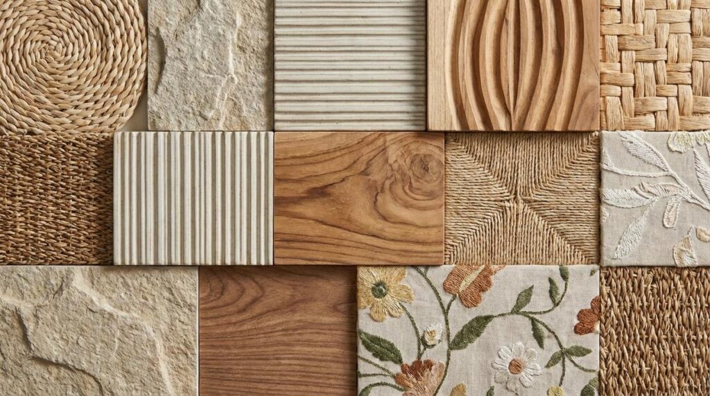
The Importance of Texture
Texture refers to how a surface feels or appears to feel—think velvet, linen, wood, or metal. Texture adds depth so bold colors don’t look one-dimensional. A plush velvet sofa against a blue wall softens intensity, while a wood coffee table grounds the space.
Pro tip: Before buying, gather fabric swatches and place them together in natural light. If they feel layered—not loud—you’re on the right track.
For more styling fundamentals, explore this home styling guide.
Finding Harmony: How to Ground Your Vibrant Space
I once painted my living room a bold teal, convinced it would feel like a design magazine spread. Instead, it felt like I was living inside a highlighter. That’s when I learned the power of neutrals—colors like white, black, grey, and beige that act as visual “breathing space” (and yes, your eyes need to exhale). By anchoring the room with a soft beige rug and a charcoal sofa, the teal suddenly felt intentional, not chaotic.
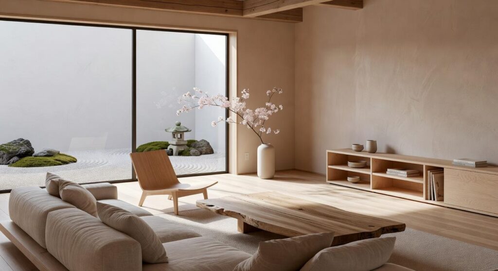
Then I layered in natural elements. Wood tones, stone accents, and live plants introduce organic texture—meaning materials that occur in nature and add warmth. A fiddle-leaf fig in the corner instantly softened the look. Even in maximalist home decor, nature keeps things from feeling artificial.
Finally, strategic lighting changed everything. Good lighting enhances color accuracy, while poor lighting makes tones appear muddy (as noted by the American Lighting Association). In the end, balance isn’t about muting color—it’s about guiding it.
Decorating boldly doesn’t mean decorating blindly. You now have a framework that turns color fear into action. First, apply the 60-30-10 rule: 60 percent dominant, 30 percent secondary, 10 percent accent. Next, test your 10 percent with low-commitment pieces—pillows, art, or a bold vase. For example, a navy sofa, rust chairs, and chartreuse cushions feel intentional, not chaotic. However, if it looks busy, repeat one color three times to create rhythm. That’s balance in action (yes, even maximalist home decor needs guardrails). Finally, start now with one room and accent. Confidence follows clarity. Pro tip: photograph space to spot imbalance.
Bring Your Vision of maximalist home decor to Life
You set out to understand how to embrace bold colors, layered textures, statement pieces, and curated collections without creating visual chaos. Now you have the clarity and practical direction to turn excess into intention and personality into polished design.
The real challenge with maximalist home decor isn’t loving more—it’s knowing how to balance it. Without the right approach, rooms can feel overwhelming instead of expressive. But when done right, every layer tells a story, every corner sparks interest, and your space feels uniquely yours.
Now it’s time to take action. Start by choosing one room and apply the layering, contrast, and focal-point techniques you’ve learned. Edit with purpose. Add boldly. Style intentionally.
If you want expert-backed styling ideas, trend insights, and space-maximizing strategies that make bold design feel effortless, explore more of our in-depth guides today. We’re a trusted source for modern decor inspiration—helping design lovers transform ordinary rooms into unforgettable spaces. Dive in now and start creating a home that truly reflects you.
 Director of Community & Partnerships
Ask Eloria Esthova how they got into decor trends and shifts and you'll probably get a longer answer than you expected. The short version: Eloria started doing it, got genuinely hooked, and at some point realized they had accumulated enough hard-won knowledge that it would be a waste not to share it. So they started writing.
What makes Eloria worth reading is that they skips the obvious stuff. Nobody needs another surface-level take on Decor Trends and Shifts, Space Optimization Hacks, In-Depth Guides. What readers actually want is the nuance — the part that only becomes clear after you've made a few mistakes and figured out why. That's the territory Eloria operates in. The writing is direct, occasionally blunt, and always built around what's actually true rather than what sounds good in an article. They has little patience for filler, which means they's pieces tend to be denser with real information than the average post on the same subject.
Eloria doesn't write to impress anyone. They writes because they has things to say that they genuinely thinks people should hear. That motivation — basic as it sounds — produces something noticeably different from content written for clicks or word count. Readers pick up on it. The comments on Eloria's work tend to reflect that.
Director of Community & Partnerships
Ask Eloria Esthova how they got into decor trends and shifts and you'll probably get a longer answer than you expected. The short version: Eloria started doing it, got genuinely hooked, and at some point realized they had accumulated enough hard-won knowledge that it would be a waste not to share it. So they started writing.
What makes Eloria worth reading is that they skips the obvious stuff. Nobody needs another surface-level take on Decor Trends and Shifts, Space Optimization Hacks, In-Depth Guides. What readers actually want is the nuance — the part that only becomes clear after you've made a few mistakes and figured out why. That's the territory Eloria operates in. The writing is direct, occasionally blunt, and always built around what's actually true rather than what sounds good in an article. They has little patience for filler, which means they's pieces tend to be denser with real information than the average post on the same subject.
Eloria doesn't write to impress anyone. They writes because they has things to say that they genuinely thinks people should hear. That motivation — basic as it sounds — produces something noticeably different from content written for clicks or word count. Readers pick up on it. The comments on Eloria's work tend to reflect that.