That stunning piece of art you love can either elevate a room to new heights or make the entire space feel awkward and “off.” The difference almost always comes down to placement. This guide removes the guesswork and delivers the core principles and modern interior techniques you need to achieve perfect balance and visual impact. With practical, easy-to-follow artwork placement tips, you’ll learn how to position, space, and scale your pieces with confidence. By the end, you’ll be able to treat your walls like a canvas—creating a harmonious, polished, and professionally curated look in any room.
The Foundational Rules: Getting Height and Scale Right
I’ll admit it: I used to eyeball everything. Hammer, nail, step back, shrug. And somehow, the art always looked… off. Too high. Too tiny. Floating awkwardly like it missed its cue. Over time (and after patching more drywall than I care to confess), I learned the foundational rules actually exist for a reason.
-
The 57-Inch Rule
Galleries follow a simple standard: hang art so its center sits 57 inches from the floor. Why 57? Because it aligns with average human eye level, creating comfortable, natural viewing (Smithsonian Design Museum guidelines). I once hung a piece at 65 inches because the ceilings were tall. It looked impressive—until everyone had to tilt their heads back like they were watching a tennis match. -
The Furniture Connection
When hanging above a sofa, console, or headboard, the bottom of the frame should sit 6–8 inches above the furniture. This creates a visual unit instead of two disconnected elements. I’ve made the mistake of leaving a 12-inch gap. The art hovered awkwardly, like it didn’t want to commit. -
Mastering Proportion
Scale matters. A single piece should be about two-thirds the width of the furniture beneath it. Too small, and it looks lost (like a postage stamp on a billboard). Many people argue negative space is sophisticated—and sometimes it is—but undersized art often just feels accidental.
For very high ceilings, adjust slightly upward from 57 inches to honor the room’s vertical scale—but don’t overcorrect.
These artwork placement tips may sound rigid. In reality, they’re guardrails. Break them intentionally, not accidentally (trust me on that).
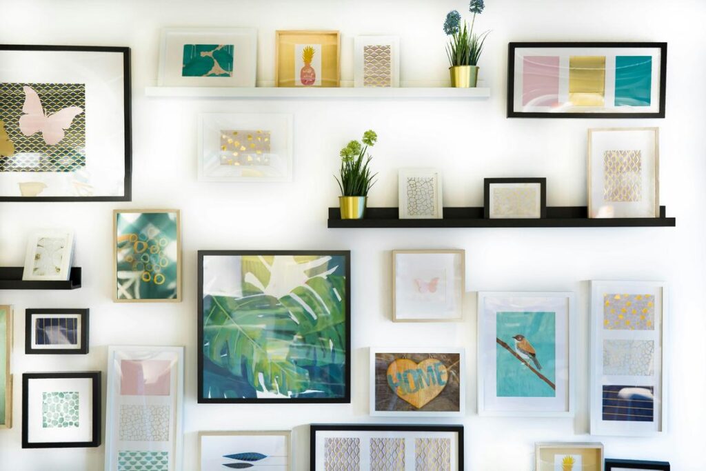
Creating Visual Harmony and Balance
Creating visual harmony starts with what designers call The Anchor Principle. An anchor is a substantial piece—like a sofa, console table, or bed—that visually grounds the artwork above it. Without an anchor, art can look like it’s floating awkwardly on the wall (as if it missed its cue). For example, a large canvas centered above a credenza immediately feels intentional because the furniture stabilizes it.
Next, consider symmetrical vs. asymmetrical arrangements. Symmetry—such as matching frames on either side of a fireplace—creates order and calm. It’s ideal for formal living rooms or spaces where you want quiet balance. In contrast, asymmetry uses different sizes and shapes arranged thoughtfully. Think of a gallery wall climbing a staircase: varied, energetic, and slightly playful (a bit like a well-curated Instagram grid). Both approaches work; the key is choosing the mood you want.
However, balance isn’t just about size. Visual weight refers to how heavy a piece feels. A small, dark, detailed painting can balance a larger, pale minimalist print. Color saturation, contrast, and subject matter all affect weight. If one side feels heavier, adjust spacing or add a complementary piece to even things out.
Finally, unify grouped art with one consistent element—matching frames, identical mat boards, or a shared accent color. This creates cohesion without sacrificing personality. Pro tip: before committing to nails, map your layout on the floor first—one of the simplest artwork placement tips that prevents unnecessary wall repairs.
How to Design and Hang a Flawless Gallery Wall
A gallery wall looks effortless—until you start hammering nails and realize it’s not. So before you commit, slow down and follow a more strategic approach (your drywall will thank you).
-
Plan Your Layout on the Floor
First, arrange all your pieces on the floor. This step is non-negotiable. By perfecting the composition beforehand, you reduce unnecessary holes and visual imbalance. Designers call this pre-visual staging—a technique often skipped in basic guides but critical for symmetry and flow. Think of it like blocking a movie scene before filming. -
Trace and Tape
Next, create paper templates of each frame and tape them to the wall. This allows you to experiment with height and spacing in real time. Many tutorials stop at “eyeballing it,” but precise mockups are what separate polished spaces from Pinterest fails. -
Choose a Layout Style
Decide between a structured grid (aligned rows and columns) or an organic salon-style mix. Grids feel modern and controlled; salon layouts feel layered and lived-in. Neither is better—it depends on the room’s personality. -
Maintain Consistent Spacing
Keep spacing uniform—typically 2–3 inches. Consistency creates intentional design (pro tip: measure from frame edge to frame edge, not center to center).
For deeper artwork placement tips and guidance on turning your wall into a standout feature, explore how to create a focal point in any room using statement decor.
Advanced Techniques for Unexpected Visual Impact
The Art of the Lean sounds fancy, but it simply means placing framed art so it leans against a wall instead of hanging it. Rest it on a mantel, shelf, or console table for a relaxed, layered look. Because nothing is nailed down, it’s easy to swap pieces seasonally (or whenever inspiration strikes).
Think Beyond the Living Room by adding art to kitchens, bathrooms, and hallways. These functional spaces often feel overlooked, yet a small framed print above a towel rack or beside pantry shelves adds instant personality. It’s like giving your home a cameo glow-up.
Hanging Art on Bookshelves breaks up long rows of books. Tuck smaller frames between stacks to create depth and visual rhythm.
Layering Frames means placing a smaller frame in front of a larger one—or even hanging it from the larger frame’s glass. It sounds complex, but it’s just smart artwork placement tips in action.
Your Home is Now a Curated Space
You now have the framework to position art with confidence, turning empty walls into intentional design moments. With these artwork placement tips, every piece adds balance and visual impact. Stop staring at blank spaces—start hanging, arranging, and creating a home that truly reflects your personal style.
 Director of Community & Partnerships
Ask Eloria Esthova how they got into decor trends and shifts and you'll probably get a longer answer than you expected. The short version: Eloria started doing it, got genuinely hooked, and at some point realized they had accumulated enough hard-won knowledge that it would be a waste not to share it. So they started writing.
What makes Eloria worth reading is that they skips the obvious stuff. Nobody needs another surface-level take on Decor Trends and Shifts, Space Optimization Hacks, In-Depth Guides. What readers actually want is the nuance — the part that only becomes clear after you've made a few mistakes and figured out why. That's the territory Eloria operates in. The writing is direct, occasionally blunt, and always built around what's actually true rather than what sounds good in an article. They has little patience for filler, which means they's pieces tend to be denser with real information than the average post on the same subject.
Eloria doesn't write to impress anyone. They writes because they has things to say that they genuinely thinks people should hear. That motivation — basic as it sounds — produces something noticeably different from content written for clicks or word count. Readers pick up on it. The comments on Eloria's work tend to reflect that.
Director of Community & Partnerships
Ask Eloria Esthova how they got into decor trends and shifts and you'll probably get a longer answer than you expected. The short version: Eloria started doing it, got genuinely hooked, and at some point realized they had accumulated enough hard-won knowledge that it would be a waste not to share it. So they started writing.
What makes Eloria worth reading is that they skips the obvious stuff. Nobody needs another surface-level take on Decor Trends and Shifts, Space Optimization Hacks, In-Depth Guides. What readers actually want is the nuance — the part that only becomes clear after you've made a few mistakes and figured out why. That's the territory Eloria operates in. The writing is direct, occasionally blunt, and always built around what's actually true rather than what sounds good in an article. They has little patience for filler, which means they's pieces tend to be denser with real information than the average post on the same subject.
Eloria doesn't write to impress anyone. They writes because they has things to say that they genuinely thinks people should hear. That motivation — basic as it sounds — produces something noticeably different from content written for clicks or word count. Readers pick up on it. The comments on Eloria's work tend to reflect that.